

Spring 2023
Healthcare has an Information Problem
A New Care-Finding Information Experience

We’re introducing a booking wizard that brings the information to you, and a Care-Corner, a smart guide that provides suggestions and answers questions.
My Role
Research & Strategy LeadI set the research strategy and led the sponsor relationship with UW Medicine's Digital Experience team, directing synthesis across patient and provider interviews. I made the case to widen our scope beyond a website redesign to the full care-seeking journey — and got sponsor buy-in to proceed on that basis.
Overview

Booking Wizard - Using natural language processing and a recommendation system, the new book-an-appointment process brings care to the user.
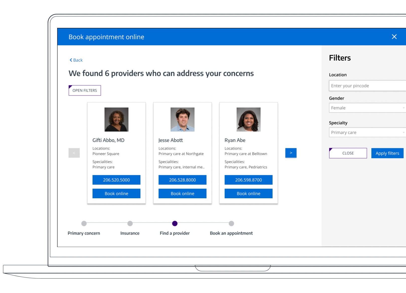

Contextualized Smart Guide - CareCorner is a contextual smart guide available to anticipate needs and provide clarity.
CONTEXT
UW Medicine's Digital Experience team came to us with a scoped ask: fix search- result ordering and consolidate fragmented entry points on their website. Early research made clear the real friction lived upstream of the website — in insurance confusion, scheduling friction, and communication gaps spanning the entire care-seeking journey, not just the page a patient happened to land on. I made the case to widen scope from a website redesign to the full patient journey, from first symptom to booked appointment. UW Medicine's team agreed, which let us pursue solutions well beyond a simple redesign.
Design Question
How might we create the best-in-class holistic care-finding experience?
PROTOTYPE
Demo Video
Research Insights
Don’t make me call
Patients only like to call in if they have questions or clarifications they need help with - this could be questions like: “Is this the right type of physician I should see?” “I cant find what I am looking for - can you help?” “Should I be seeing a PCP or urgent care for this?”
If a patient knows what they are doing (who they need to see) then they would rather book online with all their info in one place. This often looks like a patient having a browser window open with the scheduling app (MyChart) for appointment availability, a map with directions from home to the appointment location, a detailed bio about the physician, an insurance website, and cross-referencing with their own calendar for availability.
If a patient has special needs, like they are blind or elderly and don’t use computers, then they will only be calling in since most websites (including uwmedicine.org) do not work well with their assistive technology.
Lack of Insurance Information
The lack of clarity or miscommunication in the care-finding experience is the most frustrating part of the process for patients. The lack of clarity in the insurance process (and potential costs) provides patients with the most distress.
Patients will check their insurance website and the provider’s website before scheduling to ensure the provider is covered by their insurance. This process is tedious and involves multiple places to check and recheck.
Additionally, the terminology used by insurance providers can be confusing for first new users.
All pieces in one place
When speaking with patients about their experience of finding medical care, the positive + negative experiences they have had, we asked about what the ideal process would look like for them. Consistently, participants mentioned wanting to have all the pieces in one place! This includes the insurance information, provider information, appointment information - everything together to help give a holistic picture of their process.
Prioritize Location + Connection
When talking to patients about what they prioritize when finding a medical care provider, the top of the list was the location and closely followed by connection with the provider.
For the location, they were searching for somewhere that was easily accessible given their schedule and transportation requirements. This could be somewhere they can transport themselves to in the limited time allotted in their schedule or somewhere that took into account public transit routes and/or parking availability.
For connection, they were looking for a provider that understood and truly listened to them. If they could not find any provider within their area then they might prioritize this aspect and look outside their immediate physical location for someone that did want to connect with them and foster that relationship for years to come. This could be someone who was African American with PCOS looking for someone that didn’t dismiss their experience but really took the time to understand and build a treatment plan that worked for them.
Lastly, there was a hodgepodge of secondary priorities like if a provider is covered by insurance, if appointments are available within a given amount of time (usually the next couple of months), and if a provider is accepting new patients.
Research methods
literature review
site map
survey
patient interviews
subject-matter expert interviews
heuristic evaluation
concept study
usability study
Design Process
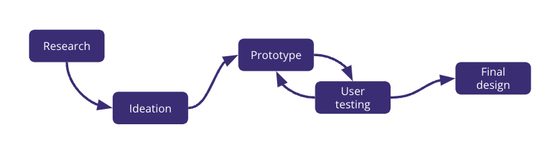
Design Principles
clear and actionable - as clear and simple as possible for patients
focus on the holistic experience - bring the pieces together into a single source of truth to help them weigh their options
Empower choice in communication - while calling may be unavoidable due to systems in place, finding alternatives or workarounds may be possible to allow patient comfort
set expectations - be clear and upfront about what is to come and how long things might take and what next steps (ex. how long, all the steps in the entire flow)
OUTCOME
We presented our final concepts — the Booking Wizard and CareCorner — to UW Medicine's Digital Experience team at the close of the capstone. The team responded most strongly to the scope shift itself: validating that the booking friction they'd originally asked us to fix was a symptom of a larger journey problem, not a standalone website issue. Both concepts were flagged as directions worth exploring further in their ongoing digital experience roadmap. The bigger takeaway for me was strategic: sponsors often scope a problem based on where the pain is visible to them (their website), not necessarily where the pain originates for the user. Making the case to widen scope — and having the research to back it up — was as important as any single insight we surfaced.
Collaboration
Built in collaboration with Simon Sun (Product Design) and Natasha Paul Stephen (Product Design) as part of the University of Washington (UW) Human-Centered-Design & Engineering (HCDE) Masters Capstone program. A special thanks to the UW HCDE teaching staff, our research participants, and our UW Medicine sponsors. We could not have done this without your patience and wisdom!